colour pallet
Through out the film, my aim was to have one colour pallet, but change the hue and luminance through out the film to result a contrasting result, making the film more surreal and expressional
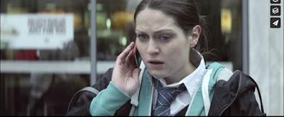
my colour pallet will consists of the colour red, baby blue, baby pink and green
at the start> ACT1, the colour grading will be warm tones, saturated and bright. Reflecting the innocent feel of my protagonist youth, but also to mirror a encouraging feel to it.
ACt2> when the climax approaches, the luminance and hue of the colour pallet will change to a more blue/green tint, highlighting the red (as they are opposite colours) creating a more gritty and raw feel, reflecting the damage in my protagonist mind. The green grittiness will escalate more and more to liberate on how she feels
ACT3> at the end, when we are back in reality, or her reality now, the colour pallet is faded and is the total opposite of how the film started. This is to embody how her colourful world has now faded because of the words that have built-up with time, resulting in her losing her colourful view of the world
my aim for my colour pallet was to show the contrast of how the same colours can be seen and feels differently when used in certain contexts, which I wanted it to metaphorically represent how words can feel differently depending on the context
Meaning of each colour and why I chose it
red
I chose to use red as I wanted to reflect my characters building of internal anger. Red can also embody blood, which can be used to show the pain and damage that my character has been through. The colour red is a bold colour, which works well with my other colours, automatically highlighting itself
Blue
I chose the colour blue due to the though and feeling that reflects from it of innocent and youthfulness. The colour blue is often associated with younger children especially boys. which I aimed to use it as in the first act, i wanted to present the feeling of youthful innocence. Later on, the colour blue becomes more gritty and reflects a colder tone, this is to contrast and mirror how the same colour can be read in different ways depending on the context. The colour blue can be seen as the table cloth and through paper backgrounds, as I liked the contrast of red and blue, as it highlights the red .


Comments
Post a Comment